sima
sima reband
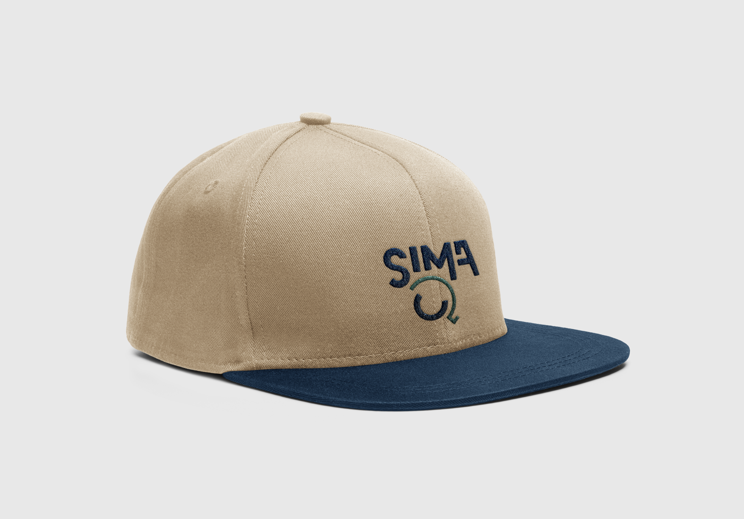
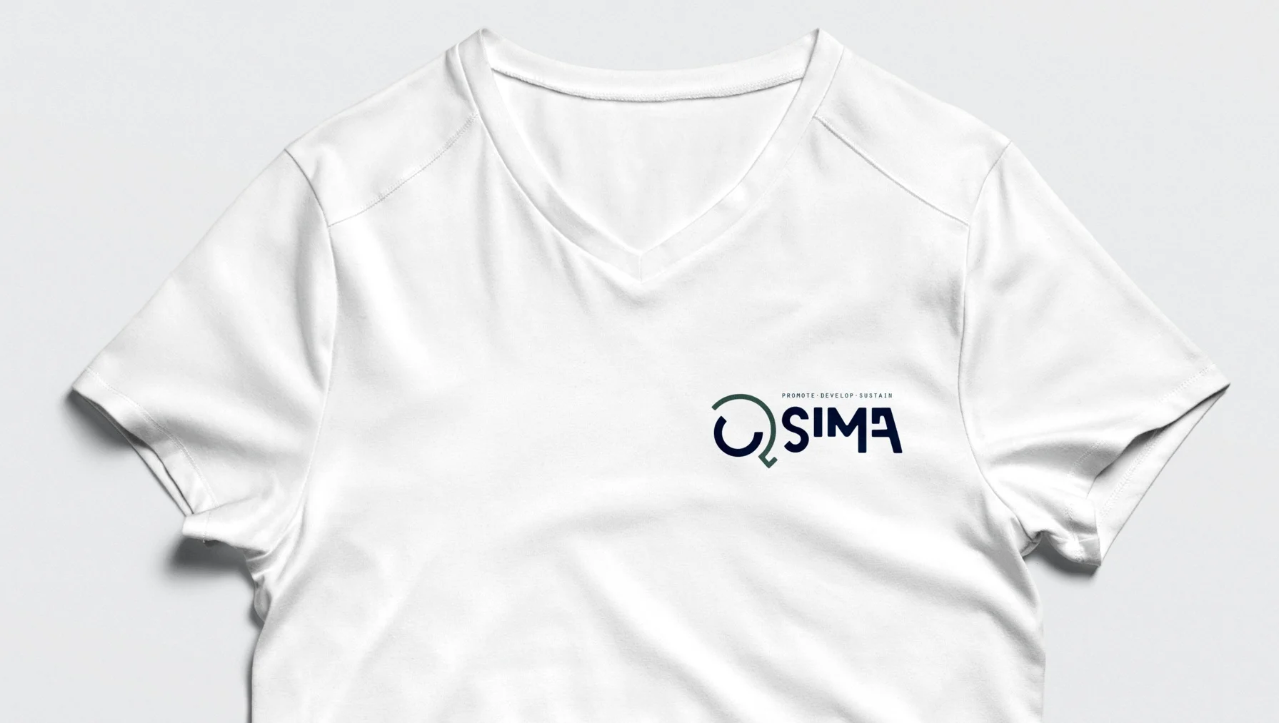
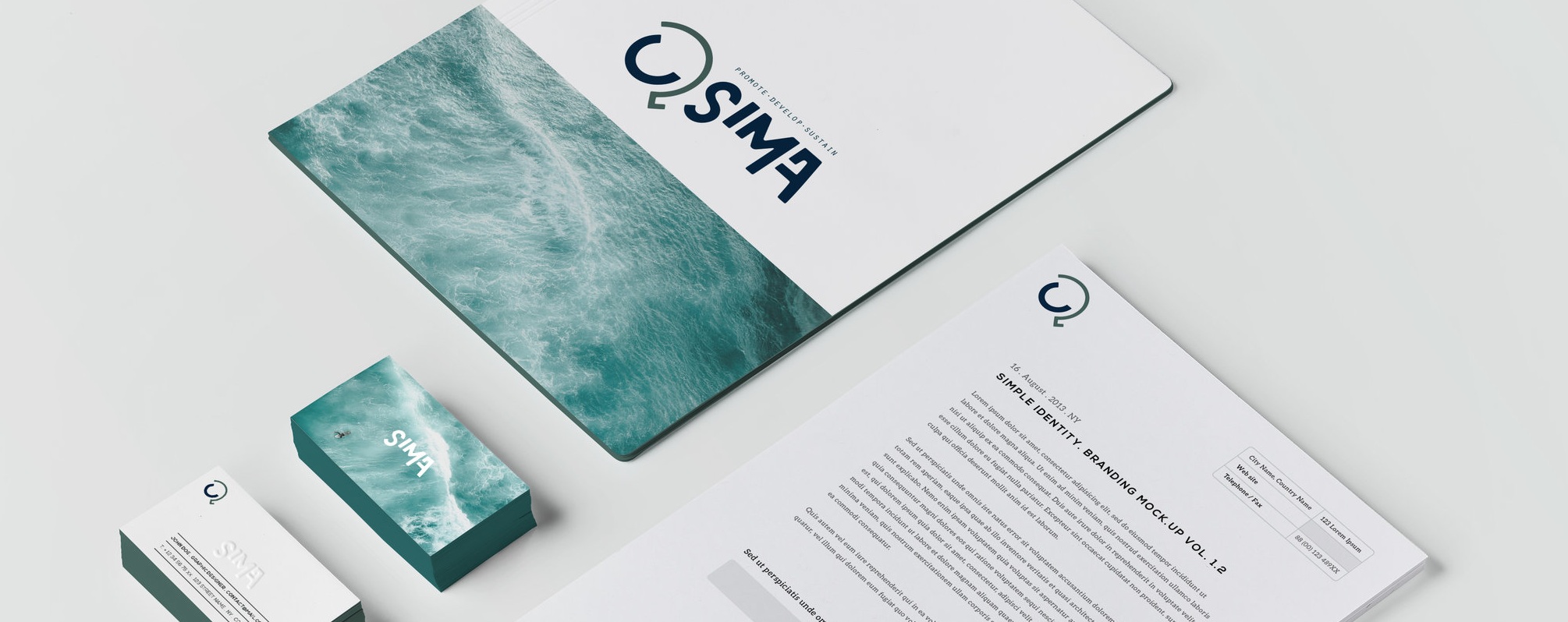
The concept behind he Nomad logo is that surf is available to everyone. Thus the logo alludes to the shape of a globe as surf and SIMA are global and all inclusive. As surf has no specific home, the circular shape with the diagonal motion cutting down through the shape also alludes to the nomadic symbol of “good way” as SIMA leads a good way for the surf industry into the future.
Skills
Brand Identity
Logo Development